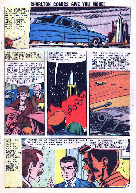
Here's Rocco Mastroserio with a game attempt at Charlton's Captain Atom. a feature normally associated with the incomparable Steve Ditko. In fact, I'd go so far as to say that most people don't even realize that anyone besides Ditko EVER drew Charlton's version of the Captain!


5 comments:
So, I'll comment on what is on the minds of all other readers now, the lettering of course.
The characters have a high degree of regularity, but there are enough exceptions to make guided lettering (eg, Leroy lettering) or something more fully automated seem very unlikely. The design of the ‘M’ is just awful. The ‘!’ is lousy. The ‘V’, ‘W’, ‘Y’, and comma aren't great either. (Every letter in the alphabet appears in this story at least once.)
I am always delighted to see Rocke Mastroserio get some attention. I believe that if Rocke had not passed away still relatively young, he'd have become a greater part of comic book history. His work has a vigor and zest which I really enjoy.
DC did reprint these stories in addition to the Ditko ones in their first Action Hero Archive, a rare tip of the hat to non-Ditko Charlton from DC.
Glad you're featuring one of my favorite artists. Thanks.
Rip Off
considering that Mastroserio was one of the few people at Charlton that Ditko actually liked inking him, it's not surprising that Rocco would tackle the full art chores---and quite effectively too!
As always, another fine post, Steve!
Fester
Regarding the lettering...this is the famous Charlton lettering machine. I think it was Dick Giordano who described it in an interview. It was a kind of huge typewriter using a custom lettering font, with a carriage large enough to feed the old twice-up originals. He commented on the poor spacing of certain letters. Note also the uniform (very large) word spacing.
I too am a fan of Mastroserio's, and something about this story doesn't look right. The layouts, several heads (e.g. page 3 panel 2) and the outrageously faked jets and cars make me think someone like Bill Molno is under there, hidden by a particularly strong RAM ink job.
I recall seeing some lettering credited to "A. Machine", but hadn't noticed the letters being quite as bad as these. Maybe I just wasn't paying attention. Perhaps letters were 'repaired' with ill results; otherwise, I have to wonder about these letter-designs.
I notice that 'I' as a pronoun has serifs, but most or all other instances of it do not.
Post a Comment